Friday, March 28, 2008

Armory Show

The Armory Show at Pier 94 was a great opportunity to see entirely contemporary work. Galleries from around the world came to the show. I quickly encountered the myriad of haughty, elitist crowds that you associate with the art world. ("Gourmet" sandwiches costed $10+...and they had mere vegetables on them and were on your average wheat bread. Ridiculous.) However, regardless of these elitists, the art felt very attainable (and obviously this is the main purpose of the galleries in the Armory Show -- to sell their artists); there were no paintings behind glass. There were no guards watching your every move. Even though there were the snotty aristocrats, there was still a casualness to the whole affair, which was really appealing to me. I'd much prefer this setting to the MoMA. I saw a lot of inventive, fresh work at the Armory, and I was really excited that I was fortunate enough to be in town for it.
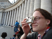
Inside the Armory Show.

Alessandra Sanguineti's  "On the Sixth Day," is a photographic series she shot while in Buenos Aires. They served to document the relationship  she observed between man and animal while in Buenos Aires. These pieces were really powerful and disquieting. 


Michael Romer's piece Time is a projection of tiny black forms pacing across a piece of ashen rock mounted on the wall. The buglike forms, which represent humans, projected on the ageless rock creates a mood of insigificance in the face of time -- in the face of deep geological time.


I was really struck by the German artist Erik Schmidt's painting:


This reproduction does it absolutely no justice (as reproductions usually don't). I snapped a quick picture of it while a man was measuring it for his living room...It's composed entirely with thick dollops of paint. There's no chiaroscuro; it's a pointilism affect. Although he employs the techniques of the Neo-Impressionists, the affect is nothing like a Seurat. There isn't the calm, cool, calculated nature that you see in a Seurat. The dollops are much messier and thicker, and thus disquieting. It's a painting in this series Schmidt did of fox hunters. Although when I saw it I assumed it was an image of a soldier on a battlefield.


Vanessa Beecroft's three black figures laid on a flat, metallic table as though they were in a morgue. I believe they were done in bronze and perhaps wax. The bodies themselves looked like they had been discovered from an ice age; their skin looked rough and earthen, like worn leather, yet cold. They laid in the middle of the gallery's exhibit, and they confronted you as a chilling surprise.


In Dirty Fucking Rats, Tim Noble and Sue Webster combined a pile of trash to miraculously cast the shadow of two rats on top of one another. Quite ingenious!
An exit!

Thursday, March 27, 2008

WACK! The Feminist exhibit in P.S.1

I've always felt that the best art should show rather than tell. Subtlety is everything. So, I wasn't surprised that, on the whole, I didn't appreciate the exhibit at P.S.1. In a lot of ways, I was disappointed when I witnessed certain pieces created during the '60s and '70s. Women wanted to assert their sexuality, and gain a kind of ownership over their body. There's a long artistic tradition (and in our general culture) of treating the woman's body as something precious, delicate, and dainty, as something to be on a pedestal. The feminists seem to have felt that one way to shatter this perspective was to showcase pornography, or do really crude performance pieces. For me, this kind of work furthers the idea of the woman's body as an object -- a sexual object -- rather furthers the idea of female independence or self-ownership.

In terms of the show's relevancy for today's times, the exhibit felt dated. While I was there, I took a rough tally of the audience at the exhibit. An overwhelming majority of the people there were women. I would say I saw probably 3 or 4 men there who weren't with our group from the U of O. So, if the show's goal was to enlighten or to make some noise, induce reform, then it was a moot point; I got the impression that the people at the exhibit seemed to be people who were already aware of this caliber of feminist art and were familiar with the movement. 

However, I'm pretty sure the show wasn't that ambitious; reformation wasn't the goal of the exhibition. It was instead more of a retrospective. Women seem to be entering the world of contemporary art more and more, and this exhibition seemed to serve as a reference point and stood to say, "look how far we've come." 

A few pieces I did really enjoy were those of Yoko Ono and Adrian Piper. They weren't as "in your face." They were quieter pieces; in fact, they were pieces about silence. A friend once told me about this teacher she had in elementary school; in order to quiet the class, this teacher would always whisper. Yelling would only add to the classroom's pandemonium. Whispering made the kids curious, and they would quiet down in order to listen. 

Instead of giving knee jerk, emotive reactions to gender injustice, Piper and Ono seemed to give contemplative, more thoughtful responses to the gender and social issues of their time.  

Below is one of Adrian Piper's photographs documenting Food for the Spirit. This was a solo performance piece where by she subsisted on constant readings of Immanuel Kant, fasting, and living as a hermet. She documented the experience by taking photographs of her body as it deteriorated, and she kept an extensive journal with these photos pasted inside it. 


This is a still from Yoko Ono's  performance "Cut Piece." She sat on a stage, her legs underneath her, and invited members of the audience to come on stage and cut her clothing from her. You watch as she slowly becomes more and more aware of herself and her impending nakedness. She sits silent and helpless as she becomes vulnerable and her clothes fall away. 

It could be seen as a comment on rape, and seen as an almost invitation to witness firsthand the emotions one might go through during that kind of experience. But, being somewhat familiar with Ono's work, and knowing that she is interested in work which tries to dissolve or break down social barriers and assumptions, I would say she is just trying to create a moment of intimacy between she and her audience. She invites the audience to cut off her clothing, to tear away her pretensions in order to see her in a vulnerable state; this creates a bond between she and the audience.

Her work often deals with relationships, and limitations in relationships, and how to create intimacy and bridge these gaps and limitations between people. For instance, I saw her on the Conan O'Brien show once, and she brought to her seat a black sheet. She invited Conan to go under the sheet with her -- only the two of them, no one from the audience could see them -- and under this sheet they could do absolutely whatever they wanted. I'm not sure what they did under there, but I'm pretty sure Conan came out with his shirt off.


Sculpture Center

Erik Smith's piece "Who, Among Us, Deserves Eternal Life," confronted us as we approached the entrance of the Sculpture Center. I was especially intrigued by the piece, given my fear of car crashes. 

The Sculpture Center is a non-profit art institution dedicated to "experimental and innovative developments in contemporary sculpture," or so says the institution's mission statement on the web.  

Once inside, we were given a debriefing by the head curator of the special exhibition, Tom Burr's show 
Addict
-Love. Burr's work is fairly minimal, and relies heavily on symbols and signifiers. His work evokes empty theaters and abandoned sets, discarded props. His pieces are often very geometrical, and he has the reoccuring theme of banisters and balustrades, which serve as stark dividers. 


Light Cavalry consists of a died/blackened American flag draped over rails, which are atop a piece of plywood, and a chair which was once seated on the platform, but is now tipped backwards. Red flood lights dramatize the work. It seems to represent a disillusionment with the current political situation in America.  Burr's work hinges on our preconceived notions of certain symbols. The railings become more like jailbars than railing. The flag, instead of emanating notions of freedom and independence, appears as oppressive, as a heavy, black, deadening cloak. 


At right, Burr's Black Vinyl Weill Pile


Agathe Snow's The Asshole of NYC! The Best Job in the Universe (An Attempt in Conversation)

Wednesday, March 26, 2008

Whitney Biennial

We hit up the Whitney Biennial. My general impression was that of disappointment. With 81 artists, the show is meant to be representative of the spirit of art in America these days. My main qualm was with the organization of the show. When I entered the fourth floor, I felt like I was entering a thrift store. I watched an interview with one of the designers of the show, and he claimed that the Biennial is generally a pretty crammed show, but that there were even more artists this year than in years past. I also read in a NYTimes article that, “Rather than organizing the Biennial in a conventional linear path, the curators have organized it so the visitor picks where to begin: any room on any floor in either building. ‘It’s a choose your own adventure,’ said Shamim M. Momin, an associate curator at the Whitney.”


Mm, yea. Choose your own adventure. Or, rather, choose your own nightmare!! Hah. jk. But I really was quite unimpressed. There was a lot of video installations, and just general installation work, which I’m not too keen on. I feel like this type of work is often very conceptual, which I can dig, but not if craftsmanship goes by the wayside, which seems more and more to be the case.


Take the video by Stanya Khan and Harry Dodge, for example. Their film, Can’t Swallow It, Can’t Spit It Out, was done with a shaky handheld camera, and the performance was improvised. Khan herself played the protagonist, who is a woman who walks around Los Angeles, disillusioned, in a Vikings hat, rambling to the cameraman. 

Apparently she begins to develop a relationship with the cameraman, and this is where it gets interesting. I didn’t stick around for this. Maybe if I HAD watched the whole film, I would’ve become privy to this relationship, and picked up on the conceptual undertones, but I was just too disappointed with the quality of the film to stomach anymore of it than I already did. It felt like something my friends and I would’ve put together in high school. In fact, I’m pretty certain we’ve had ideas for films which were of equal caliber (although they never came to fruition).


I watched the majority of Olaf Bruening’s video Home 2. It features a tall, lanky redhead who sports white contacts and travels to various countries, completely oblivious to these countries’ native way of life. It takes on the air of a slapstick comedy and could probably be easily confused as an outtake for Jackass. The oblivion of this character is hilarious, yet at the same time profound. It comes as a commentary on the globalism of today, and the inevitability of insurmountable cultural differences and the inevitability of insensitivity to these differences:

http://web.mac.com/olafbreuning/Films/home2.html

Some other pieces in the show:

Seth Price. Untitled. Birdseye maple, butternut walnut, and plastic.  


Matthew Brannon. Steak Dinner. Letterpress.


James Welling. Torso 3
One piece in a moody, sensual series of photograms of cut screens shaped like bodily contours. The photos are large, roughly 57" by 47."

MoMA

Our tour guide at the MoMA had us all take a seat on the floor, cross-legged, in front of Demoiselles d'Avignon. And she asked we raise our hands to answer her questions. "What makes this work modern?" she asked...As bona fide students of art, we felt a little degraded. :/

I saw this woman posing in front of Warhol's Orange Car Crash 14 Times, and I couldn't help but laugh:

It was such a warm smile.

I saw my first Matisse that I actually liked (View of Notre Dame).

Although that is a lousy reproduction (as usual) of it.


I was once again illuminated by the powers of Dan Flavin. It's brilliant (hah. hah); the light serves to both brighten the corner and obscure it. 


I love Pierre Bonnard's piece called The Bathroom, of 1932. I'm attracted to the fact that he relies heavily on pattern, yet doesn't 
completely disregard three-dimensionality and volume in his figures. I'm mainly drawn to it because of its strong, graphic composition. That, and I like dogs. 


The special exhibition, Color Chart, made me question how I use color in my work. As I was just mentioning, I tend to be more interested in composition, as opposed to color. In fact, I tend to work in black and white. I can't say that I have any advanced, particular color theories of my own. It depends on the context of the color; what the content of the piece is, and that serves to inform the colors and how they may be interpreted. I'm always excited to see Sol LeWitt's wall drawings. One of the LeWitt drawings there was a small square drawn on the wall. The only requirement for this square was that the 12 basic crayons in a Crayola box be used (in their entirety). So of course the drawing had this almost sculptural quality, waxy depth to it, very tempting to touch. (But I was good! I kept my paws off.)  

Tuesday, March 25, 2008

Even the Ghost of the Past -- Dzama

We spent about five hours in the Chelsea district, looking at galleries. Apparently they have over two hundred galleries there. I preferred those galleries to the enormous museum spaces. It made me furthermore realize the importance of context. This trip we’ve been able to see a lot of different approaches towards display. It seems the Dia: Beacon was most conscious of the significance of display. They were so conscious of it that they prohibited any bags inside the museum, saying it was meant to be a “spatial experience.” That may sound pretentious and cantankerous, but I think there is credence to it. It’s distracting to have bags, cameras and coats hanging off of you.

I hated elbowing my way through the MoMA and the Met, and even the Guggenheim to an extent. I feel like it’s so peculiar that the artmaking process is such a solitary, singular e

xperience – it’s usually (at least in the western world) one person, alone in a studio, creating -- yet once the art is finished it is, if it’s lucky, placed in a crowded, labyrinthine museum where people get themselves lost in complex floorplans. What’s more, in the bigger museums, you get people who are only there because they feel obligated to be there. I saw way too many people walking around with their cameras, stopping in front of a piece only to take a photograph, then swiftly moving on (more on this later though; I had an encounter >:/ ) I feel like this distracts from the art, and puts it on a pedestal, and takes away its relevancy. It’s almost as though it solidifies and entraps it within the art history canon, and you are forced to view the art in terms of an art histry narrative rather than for the charm of the particular piece itself. And this feels to me a diminishing of the work. Plus, the guards are always so protective of the work, asking you to please step away from the painting, etc., and this reinforces this sense of distance between the viewer and the art. The Chelsea galleries provide an intimate, one-on-one interaction with the art that you don’t get in the bigger museums.


I really enjoyed Marcel Dzama’s watercolors. There’s a precision in the paintings. They remind me of Henry Darger’s figures in terms of style, but there’s also often a similar perversity in subject matter and a fantastical, whimsical nature to the drawings. The figures exist in a more existential atmosphere; they seem to be more self-conscious and self-aware. They exist as petite figures, isolated and alone, centered in the vacuous white of the page.


His piece alluding to Duchamp’s late piece Etant Donnes. Both a woman and a man appear in his piece, plus a mischievous fox in the background. The two seem more blissful than Duchamp’s woman; this may be because we can see their faces, and they appear to be serene and blissful. It’s unclear whether they’re sleeping or dead. It seems they are only sleeping, given 

those serene expressions. Duchamp’s nude on the other hand is only a body, an expressionless torso. Duchamp's background is so picturesque, it appears as though it could be a Thomas Kincaid painting, if it weren't for the splayed nude in the foreground. The landscape in Dzama's piece is more fantastical than picturesque. I personally feel like I can’t construct a story behind Dzama’s anymore than I can behind Duchamp’s peephole,

but I think the inability to imagine a narrative is part of the piece's success. Maybe it could be a statement into the limitations of our views into the lives of others, or even to ourselves. Duchamp was creating work at the same time as the surrealists -- a time when Freud was really influential. The gas light in Etant Donnes definitely seems to be a Freudian symbol, and the entire piece possesses a nonsensical, dreamlike quality. 


Chelsea cnt'd: Brian Jungen, Diva containers


Brian Jungen's woven jerseys at the Casey Kaplan gallery bring to light issues of globalism and assimilation of culture. Kobe Bryant's Laker jersey is weaved together with Iverson's Nuggets jersey. The quilt recalls the ritualistic Gods Eye quilts of some Native American tribes; Jungen combines this strong element of pop culture -- the NBA -- with a sacred tradition. At the entrance is a red jerry can with a design of red fireflies drilled in it. The design is delicate and dainty, and contradicts the container.

I was more fascinated by the Diva containers as a concept than I was by the actual art in them. I went to three of the containers. It was strange to be in this temporary shelter from the city; you could hear the cars pass by, melding into the faint drum of the city, and feel the cold. 

Monday, March 24, 2008

(No Ideas But in Things) An Experience in Perceiving, the Dia: Beacon

We visited the Dia: Beacon today. And that was in
 itself enough. I was introduced to a lot of new ideas, and my mind felt full within half an hour. 

It took an hour train ride to reach Beacon, and I was nodding off most of the time (my glasses even dropped into my lap at one point, when sleep became too heavy to resist. That was kind of embarassing. It was like on Sunday when we were riding the L train, and a middle-aged man was seated, sleeping, with a newspaper in his hand, and he slowly let go of his grip, and the newspaper slipped to the ground, waking him up. People were watching him; he seemed embarassed.)


Anyways, the Dia. We had the greatest tour guide. I don't even know his name, in fact, he was a rather enigmatic fellow in general. He reminded me a lot of Willy Wonka. He was very casual and nonchalant, yet seemed to speak in riddles at times. He was this short man, dressed in pale, spring colors. He had an accent, I think a British accent. But he seemed to speak many different languages. 

He told us about Dia's name, and how it is in fact NOT an acronym, as one might think, but is instead the Greek word for "through." The museum is devoted primarily to minimalist sculpture of the '60s and '70s. The building is crucial to the experience. It is designed so you can often see straight across the museum, through windows, and see outside, locating yourself in the world, allowing you to create a context for yourself. I've included a few pictures of the museum and its surroundings. The black and white pictures I took myself; the others I robbed from the Net. The space feels very constructed and orderly, very geometric. (The town Beacon itself look a lot like northern WA -- the Bellingham area.)

I must say, it is probably the most navigable museum I have ever experienced. I didn't even use a map while I was there. Apparently it was once the printing factory for the labels on Nabisco cookies. Our guide mentioned that it was typical irony of the modern age for this monument for the working class and blue collar to be transformed into a house for the elite artists of the world. 

One of our group members, Brooke, asked what a particular neon light piece by Bruce Nauman meant, or what the tour guide thought it might mean, and the guide said, with a slight smirk on his face, "How should I know?" Then Brooke said something to the affect of, "Well, I thought maybe he (Nauman) had told you." The guide responded, without the slightest hesitation, "No. He didn't. Even if he had told me, I would have no reason to believe him." Then he was speaking of the windows, telling us how we could determine which windows were the originals from the Nabisco factory of the 1920s and which were restored. Someone asked him to repeat himself, and he said, waving a hand, "It's just an anecdote. Totally trivial and irrelevant. *muttered under his breath* As most things in life."

I loved Louise Bourgeois sculpture Crouching Spider. It has this grotesque quality, yet it's nothing less than exquisite and graceful. It was breathtaking the first time I saw it, in the corner of the attic of the Dia. Despite it's enormity, it doesn't 
threaten. I was drawn to it, fascinated by it, but it felt to me like it exists in a world all its own. The spider is engaging and captivating, yet, at the same time, you feel you should keep your distance. Even though
there is an interaction with the piece -- you have to bend and contort yourself in order to pass under the legs to view the entire sculpture -- there's something very ethereal and intangible about the spider. The first time I saw it, I didn't even think to move around it. The spider seems to be paused (mid-pounce, perhaps), and this cues you
to pause yourself so as not to be noticed, or at least to  pause in anticipation, waiting to see what the spider's next move is. 

In terms of the formal qualities, the piece is very organic and whimsical. The soldering marks are apparent. Despite the weight of the material, the spider appears very mobile, quick and agile (maybe this is due to the needlepoint legs.) However, the spider looks like a creature from the set of a sci-fi film.  

I copied the picture above of the Crouching Spider from flickr. Photos aren't allowed in the Dia, but I guess someone was able to snap this without anyone noticing. 

I also bought a Robert Smithson book. The tour guide illuminated much about minimalist sculpture, and especially about Robert Smithson. Smithson wrote a lot about his work, wrote a lot of theory, so his work is really enhanced when you have someone who is well versed in his theories and concepts. 

Above is Gravel Mirror with Cracks and Dust, done in 1968. The mirrors below the half mounds of grey gravel are shattered, and above the mounds are mirrors which reflect only the feet of the viewers. The piece deals with issues of identity/fragmentation of the self, and the importance of contextual information for identification. Our tour guide looked in the mirrors as we were all lined up, looking at the piece, and said, "Oh wow, now this is great. We've got a harvest of feet." 

On our walk back to the bus, we saw these:

Cai Guo-Qiang Retrospective: The Dynamics of Destruction and Beauty

I’ve seen Cai’s Inpportune piece before. I saw it in SAM this past summer, and it had a much different affect. I found it to be much more effective in the Guggenheim than it was in SAM. There was something very hokey about the installation in SAM. I was reminded of the closing scene in Grease where Olivia Newton John and John Travolta fly away from the fairgrounds together. The cars were all suspended in the air, at varying heights, and they seemed to be nothing more than flying cars – I considered the cars to be several different, separate cars, not representative of a single car tumbling through space. It was like a school of flying white Ford Tauruses. Cai’s attempt to create movement from objects so immense, hefty and static is interesting to examine.

The design of the interior of the Guggenheim really improved the affect of Inopportune. When I first saw it in the Guggenheim, I thought the car was one car, which had fallen from the top, and appeared in s

tills, falling, tumbling in freefall towards the bottom. As I looked at it m

ore, though, I wondered if the cars weren’t lifting off, spinning in the air, and landing on the top level. The spiral design of the interior also lends itself to the dynamic of the piece; it keeps your eye circulating around the cars, and opens up the piece to multiple perspectives. The audio guide talked about how Cai is very particular in the placement of his installations and adheres to feng shui principles.


The first time I saw the piece, in SAM, I considered it to be more of a technical accomplishment than anything else; I remember I was amazed that those cars were able to be successfully suspended in the air. I didn’t make the car bomb connection. I didn’t draw any political connections, but rather I thought maybe the installation was meant to be a social commentary. The first thought that came to mind for me was that it was a commentary

 on Ameri

ca’s flashy consumer culture and a commentary on obsolescence. The cars were white, and that symbolized a sort of pure, unassuming, helpless object, on which we project value and importance.  Given that my response to the pieces was so visceral, I didn’t think they were constructed with an intellectual, or political, response in mind.


There seems to be an abundance of dichotomies in Cai’s work, so the juxtaposition of beauty and destruction comes as no surprise. It is central to the concept of yin and yang in Chinese philosophy – one cannot exist without the other. These opposite natures coexist and must coexist for harmony. Paradoxes like this are central to the way our universe functions, I think. In death there is life, in life exists death. When one witnesses a car accident, the first response may be shock, disgust, aversion, but that’s followed immediately by curiosity, and attraction, rubber necking. This is perhaps due to a fascination with the unknown – death, but also with a satisfaction that the misfortune didn’t happen to one’s self. So there’s this element of voyeurism.


Sunday, March 23, 2008

The Met and More

We went to the Met today. I would've liked to spend more time there. I didn't even get a chance to see their modern collection. I did, however, get to see my first impasto Van Gogh, Sunflowers, done in 1887 (of which I've posted, at right, a lousy photo I found on the net) that was not behind glass! AND I even saw Wheat Field with Cypress Trees! One of my faves. And his portraits are always really impressive as well. 

They have a few special exhibits, including a Lee Friedlander exhibit (pics taken in Olmstead Park, I wasn't terribly impressed -- although, viewed together, these photos definitely do create a comprehensive portrait of the park) and the Jasper Johns: Gray exhibit. 

In terms of Jasper Johns, the painting I was most drawn to was Tennyson. Maybe this is due to my soft spot for poetry. Jasper Johns’ painting Tennyson of 1965 references the Victorian poet Alfred Lord Tennyson; “Tennyson” appears at the base of the painting in all caps. The painting was created with encaustic – which is hot wax mixed with pigment (an ancient technique first used by the Roman Egyptians). The painting is done entirely in greys, besides a few select splatters of primary colors at the bottom of the piece where an unpainted, exposed piece of canvas lies.


Many of Johns’ paintings in his grey series exist with a strip of unpainted canvas at the bottom. A number of these paintings utilize stencils, and symbols, preexisting signifiers. He uses

something recognizable, the name of a famous 19th century poet, to signify a mood in Tennyson. Tennyson suffered from depression, and his poems often comment on death, like “In Memoriam,” or “Charge of the Light Brigade.” And the painting itself looks as though it is Johns' gravestone for Tennyson. (Both the palette and the nature of the lettering suggest this.) I think Johns' fascination with symbolism was largely influenced by the ideas of the 20th c. psychoanalyst, Lacan, whose ideas, along with a number of other post-structuralists, were popular at the time of the painting. 

The grey seems to be an attempt by Johns to intellectualize his work. Grey is neutral; it doesn’t provoke emotional responses like colors. By using grey entirely, I feel that Johns was creating a challenge for himself. Namely, how could he maintain interest in a piece by using the most drab palette possible. He creates interest by using the medium of encaustic, by referencing Tennyson, and by the piece of paper (or possibly canvas) which he collages into the piece. 

Encaustic has such a sculptural, lifelike quality. By varying the amount of pigment you use, and how you layer the wax, you can create an infinite amount of texture and depth. The wax allows a dimensionality to Johns’ grey series. Because you can vary the opacity of the encaustic, Johns creates a dimensionality to the piece, which would be more difficult to do in monochrome with mere oil paints. Furthermore, he has created two different surface areas with the piece of canvas he lays above the name, and with the halving at the top of the painting.

In some of these series, colors, usually primary colors, peak out from underneath the swathes of grey. It’s an interesting inversion. In the classical tradition, greys are used as an underpainting, but here it is the color that is the underpainting. These types of subtleties are what make Johns’ grey clouds of paintings surprisingly captivating.

Saturday, March 22, 2008

Long Is Expwy


We arrived here in New York at around 8:30 am. Our flight was delayed; we were all exhausted. I haven't slept any more than 4 hours in the past 32 hours!
 None of this has come as a surprise though. 

We're staying in the Williamsburg area of Brooklyn. Our hostel (if you can even call it that -- it feels more like an apartment) is nicer than I expected it to be. There are four of us staying in this one room. We're shackin'
up with a couple of Korean girls who already live here. They keep things pretty clean.  


This area of Brooklyn is a really hip place.  Cafes and unique clothing stores abound. There'sa great record store next door. The manager of the hostel told us there was a mild protest of 30 people a little while back when the first chain, Subway, opened up in the area. The owner of the hostel, Jeff, told us that Nada Surf lives below us. 


And then he told us about a number of restaurants nearby which have appeared on
 tv shows. Apparently Flight of the Conchords have filmed on this street, and the Raw restaurant in Sex and the City is nearby too. I keep expecting to sight members of the band Grizzly Bear -- they're from this area. And I saw this design on a sticker posted outside the cafe we ate at that was designed by a friend of theirs. 


Anyways, this Brooklyn place. It feels different than any other place I have ever been. It's little more than concrete and 
vertical brick houses. The images I remember from the Cosby Show are a pretty good indication of the scenery. Those screenshots really are what it looks like. Thin, tall buildings crammed together. Yet, there's an...airiness, and there seems to be a sense of community though. I was looking at the back section of  Sculpture magazine, and it listed a nu
mber of internship and job opportunities for artists in New York. That made me excited, because I'm not used to seeing those opportunities in print. It's good to know they do exist and aren't some mythical holy grail. Actually, it motivated me quite a bit. 


Unfortunately I forgot to bring my cable to connect my cam
era to my computer. I may just have to buy another one (that would make 3 :x). This photograph is pretty poor. I hauled my laptop onto the balcony a
nd took a picture with isight. However, you can see the Chrysler building and Empire State Building from my room. 

I walked around a little bit. I went in a couple shops, and wow, are they expensive here. There's an American Apparel just a couple store fronts away. This is a pretty good indication of the populace we're dealing with here. There are a lot of shops, a lot of unique, one-of-a-k
ind boutiques. 

Trash in Brooklyn.

                                           A Doll in Brooklyn.


                         Meat in Brooklyn.


(Update: I didn't  succumb to the temptation of buying a new camera cable. I just uploaded these photos after the trip.)